There are plenty of theories on the history of Apple, the history behind its name, logo, and why it was the choice. For today’s generation, the meaning of Apple has been changed, it’s no more only a fruit which is available during the winters. It’s a brand and a status symbol that represents quality and standard. A brand’s name and logo play a very important role in making the brand what it is.

In the case of Apple Computer, the first product of Apple had a name that was much accessible and familiarly compared to other companies at that time. As the legend goes, while deciding on names, names like Matrix Electronics were suggested but ultimately rejected. Steve Jobs had come from an Apple farm and suggested the name Apple Computer. They decided on this name as nobody came up with anything better on that day by 5 O’clock. The name can also be attributed to the fact that Steve Jobs loved apples and also the fact that Apple was ahead of Atari in the phone book, Atari was the place Jobs worked.
Initially, when Apple computers were named the logo was nowhere to be found close to an apple. It was a picture of Issac newton and the failing apple which revolutionized science. Apple’s first logo was the description of the event when gravity was found created by Ronald Wayne in 1976.
Rob Janoff, a graphic designer was then hired by Steve Jobs who then developed the iconic logo. It took Rob 2 weeks to get the logo done, he got a bunch of apples and practically studied their shape and size, and perfected his design. The original logo had a rainbow stripe in between the logo, a nod to Apple’s Computer II which was the first in the world with a color display. The bite was designed so that people could distinguish the logo as an Apple and not a cherry tomato.
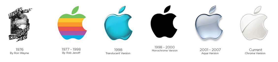
Over the years, when Jobs realized the logo can be changed for good and can be monetized. He wanted to put the logo where people could see it, with that came the first-ever iMac, to which the new metallic logo was embossed and since then the products have more prominent logos.
The logo finally has been perfected with some edits by Landor & Associates with respect to the geometry, the logo now looks more chic and defined. Apple, the name and logo is the brand’s unique selling point. The brand is in the name, and the status is in the logo.
Tell us what do you think about the iconic Apple Inc. logo revolution in the comments below!
If you like this, do read our :How Many of These Banksy Masterpieces Do You Know Of?


0 Comments